Formal Analysis II & Postmodern Reader
Elective Courses, Yale University
New Haven, CT
Fall 2021 & Winter 2022
Instructor: Peter Eisenman
The following drawings were produced for Peter Eisenman's classes, Formal Analysis II, and Postmodern Reader, at the Yale School of Architecture. These series take a critical look at canonical buildings from early modernism in 1914 until the "end" of Postmodernism at the 1988 Deconstructivist Architecture exhibition at MoMA.
VILLA SAVOYE
(1928 -1931)
(1928 -1931)
LE CORBUSIER
Le Corbusier’s idea was to design a structural system composed of a grid of columns completely independent from the functions of the plan, purely intended to support the structure, such that you could place walls freely, without consideration for structure. In my drawing for Villa Savoye, I argue that the free plan is not entirely free, as many of the so-called non-structural walls have columns embedded into them that diverge from the grid. They are not independent from the functions of the plan. In bold, I highlight Le Corbusier’s columnar grid, and in red the structural columns which diverge from the grid, which are not part of the dom-ino system intended to free the walls. Most of them are embedded either fully or part-way into the so-called freely-placed walls. I also pull out the columns to the right along with the walls they’re embedded into to illustrate this point.
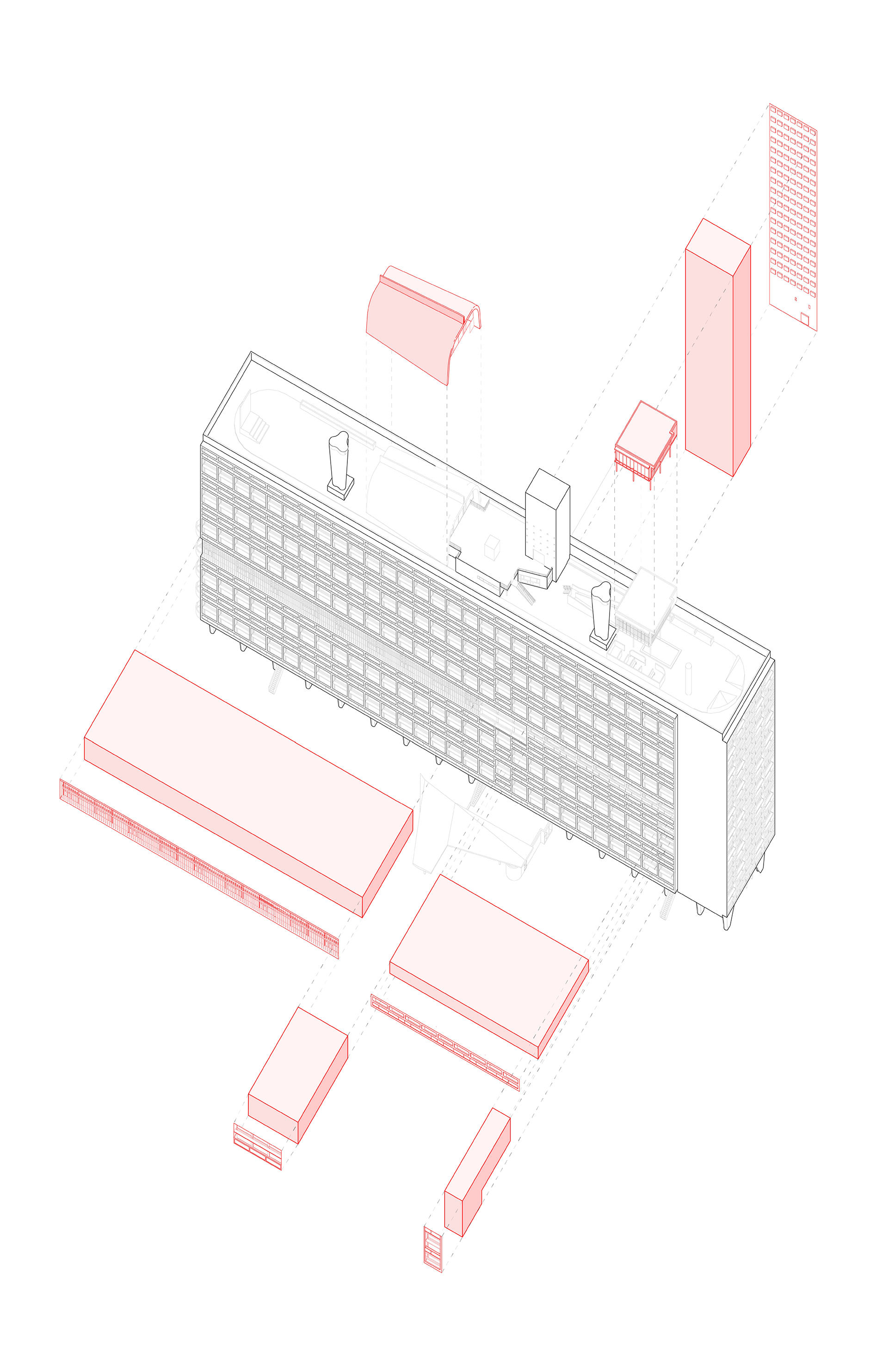
In Unité d’Habitation, the program is heterogeneous, comprising a gym, club, health center, nursery, track, shopping center, restaurant, hotel and 337 apartments all incorporated into one block and roof. In my drawing, I demonstrate that each of these programmatic elements is treated differently/distinguished on the facade/exterior. In other words, heterogeneity in internal program = heterogeneity in outward appearance, which is something you cannot say for Mies, for example.
UNITÉ D’HABITATION
(1947 -1952)
(1947 -1952)
LE CORBUSIER
VILLA ALEXANDER MOISSI
(1923)
(1923)
ADOLF LOOS
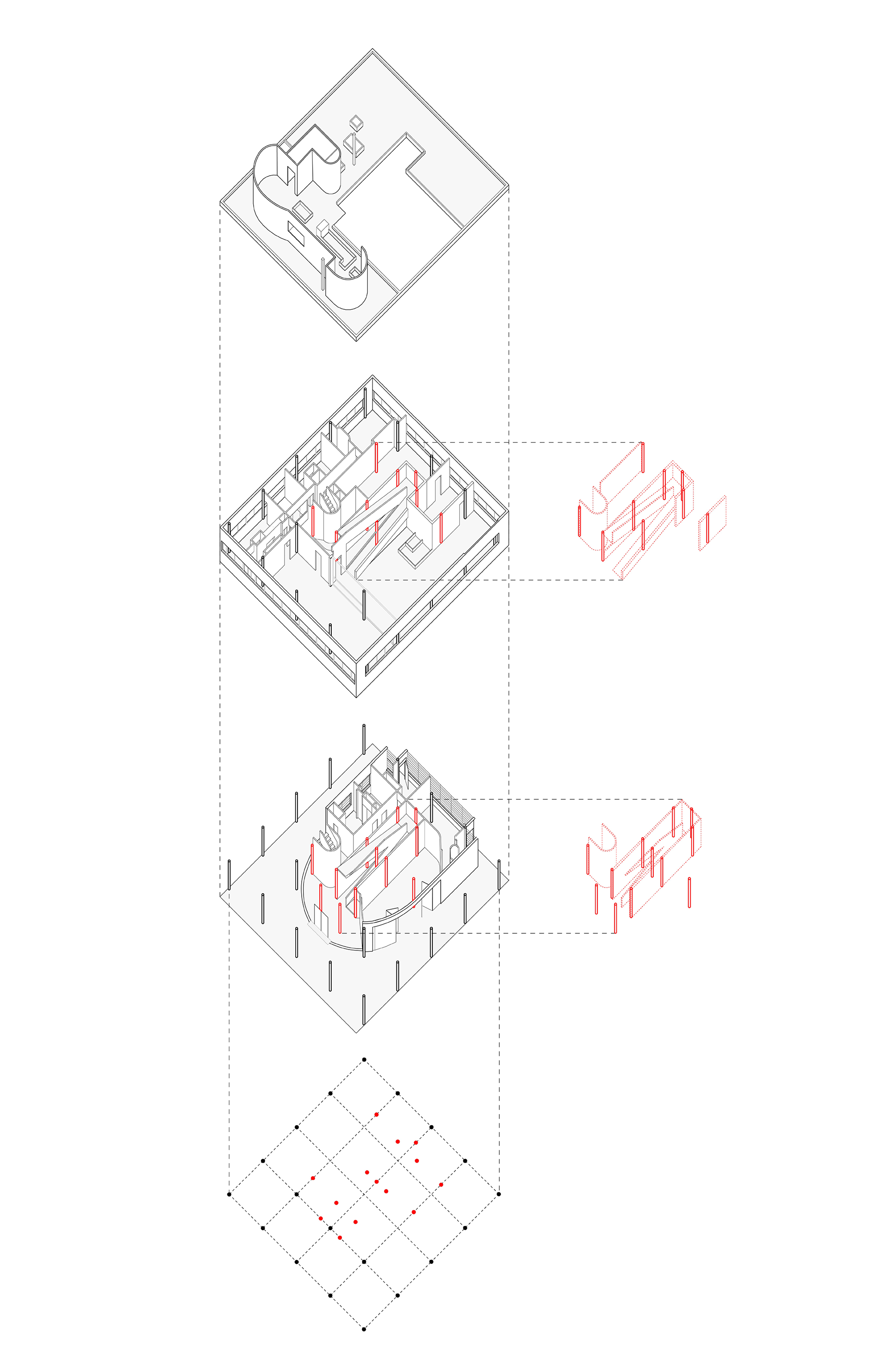
“My architecture is not conceived in plans, but in spaces. I do not design floor plans, facades, sections. I design spaces. For me, there is no ground floor, first floor etc.... For me, there is only contiguous, continual spaces, rooms, anterooms, terraces etc. Stories merge and spaces relate to each other. Every space requires a different height: the dining room is surely higher than the pantry, thus the ceilings are set at different levels. To join these spaces in such a way that the rise and fall are not only unobservable but also practical, in this I see what is for others the great secret, although for me a great matter of course.” - Adolf Loos Loos is quoted as saying that his architecture is not conceived as plans but in spaces, or cubes. Hence, raum-plan, space-plan. What I have done is visualized Villa Moissi as such. What appears to be a three-storey villa in plan is shown as an agglomeration of “spaces” exploded along six different-height planes.
For this drawing, I have visualized both Tzara House and Villa Moissi from the previous week as agglomerations of “spaces” and argue that the terraces in both qualify equally as “spaces” even though they are not defined by literal walls on all four sides. I believe there is a clear bounding box around each building which creates these conceptual walls which bound each of the terraces as though the terraces were previously rooms that Loos subtracted from the overall mass of the building.
TRISTAN TZARA HOUSE
(1925 - 1926)
(1925 - 1926)
ADOLF LOOS
VILLA TUGENDHAT
(1928 - 1930)
(1928 - 1930)
MIES VAN DER ROHE
In Villa Tugendhat, I argue that Mies makes use of the three different plan typologies: the traditional load-bearing wall system, the free plan, and the open plan. The descriptions are as follows: 1) Traditional load-bearing walls | no columns | clearly-defined rooms | not free or open (these parts of the house are embedded in the hill), 2) Free plan: columns follow orthogonal grid | thin, non-load-bearing walls independent from columns | architectural promenade | walls divide up space and are threaded through with a specific path to experience spaces in a scripted sequence | windows frame views throughout this promenade | there are still clearly rooms, even if not entirely closed off, and 3) Open plan: plan left largely unplanned (only about two interior partitions, both non-structural, despite 7-8 different-functioning spaces) | free to roam and explore | frame dissolves at its edges, creating ambiguous delineations between inside and outside, unlike the framed views of the free plan.
Comparing La Tourette and Villa Savoye, I found that VIlla Savoye is inherently a vertical experience while La Tourette was conceived horizontally. Both of these works of Le Corbusier were designed around the architectural promenade, which in the case of Villa Savoye, is an almost exclusively sloped ramp that carries the individual upward through the spaces from the ground level to the roof terrace along one continuous path. We even see that the secondary staircase, which is independent from the promenade carries the user through each level along a single path. By contrast, if we look at La Tourette, we see the building employs almost exclusively flat promenades on each level which are not connected nor relate to one another in the vertical direction, except via the service staircases, which are on the periphery and even themselves are often not continuous through each level.
SAINTE MARIE DE LA TOURETTE
(1956 -1960)
(1956 -1960)
LE CORBUSIER
GUILD HOUSE
(1960 - 1963)
(1960 - 1963)
ROBERT VENTURI
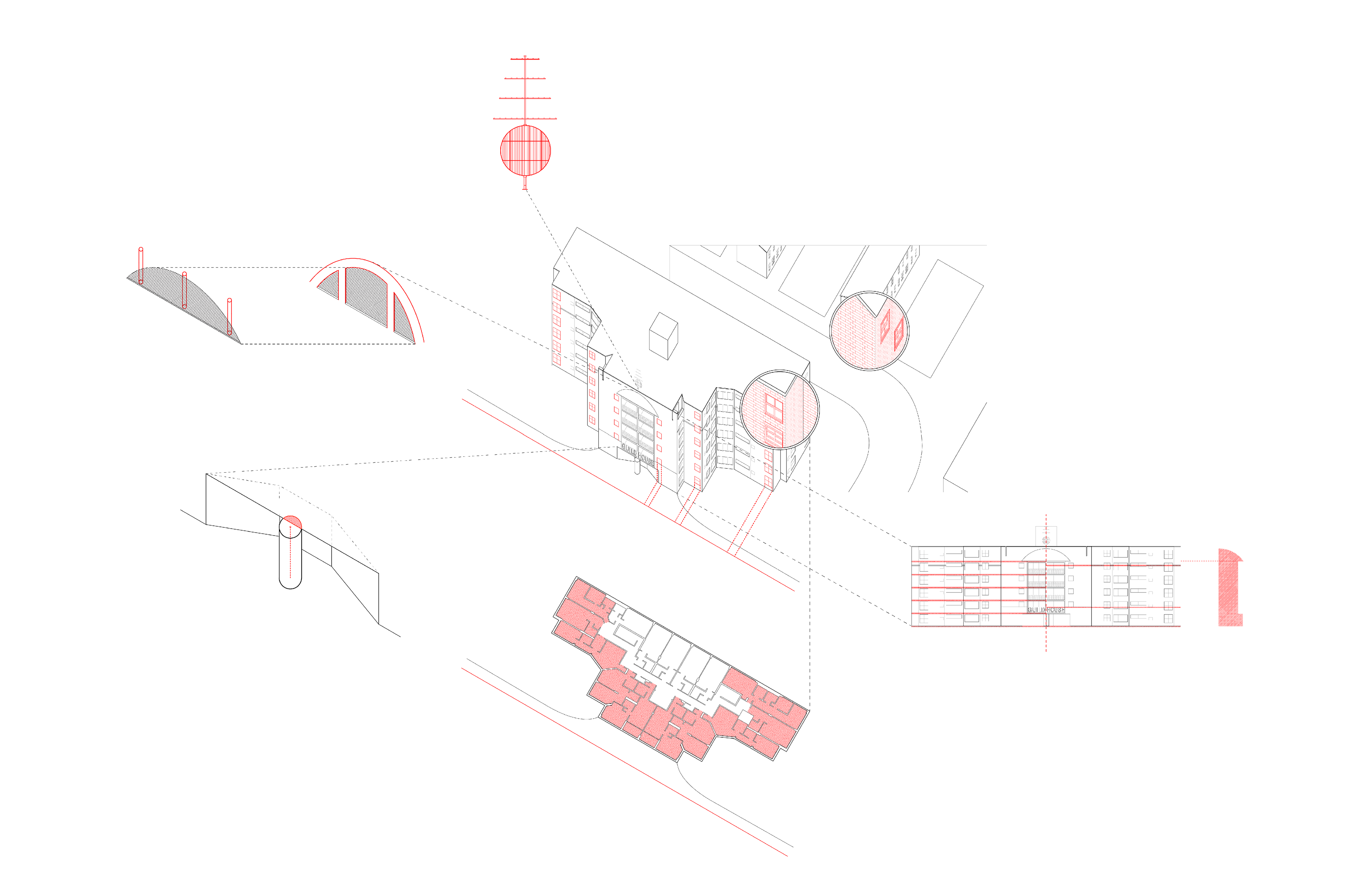
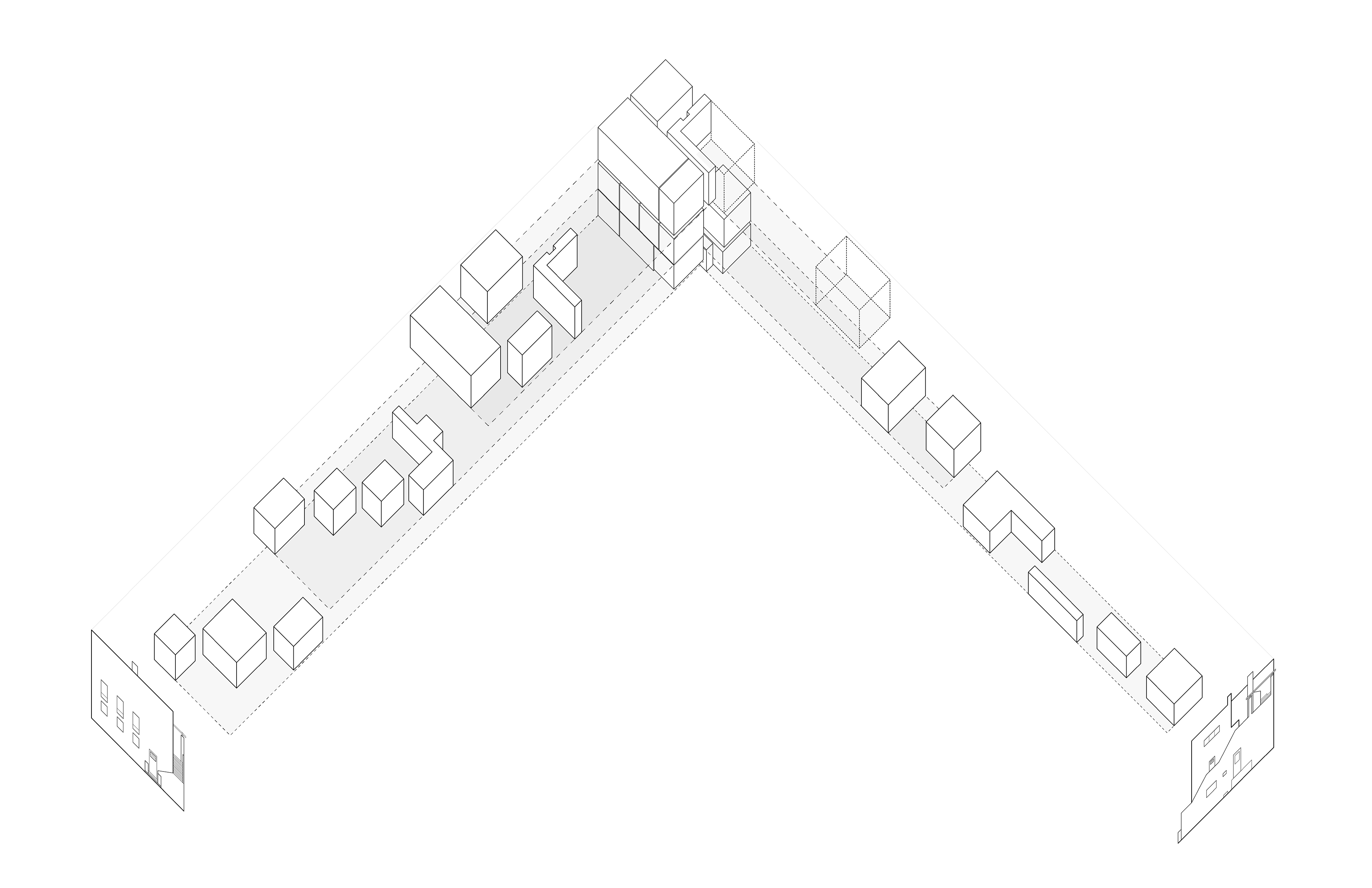
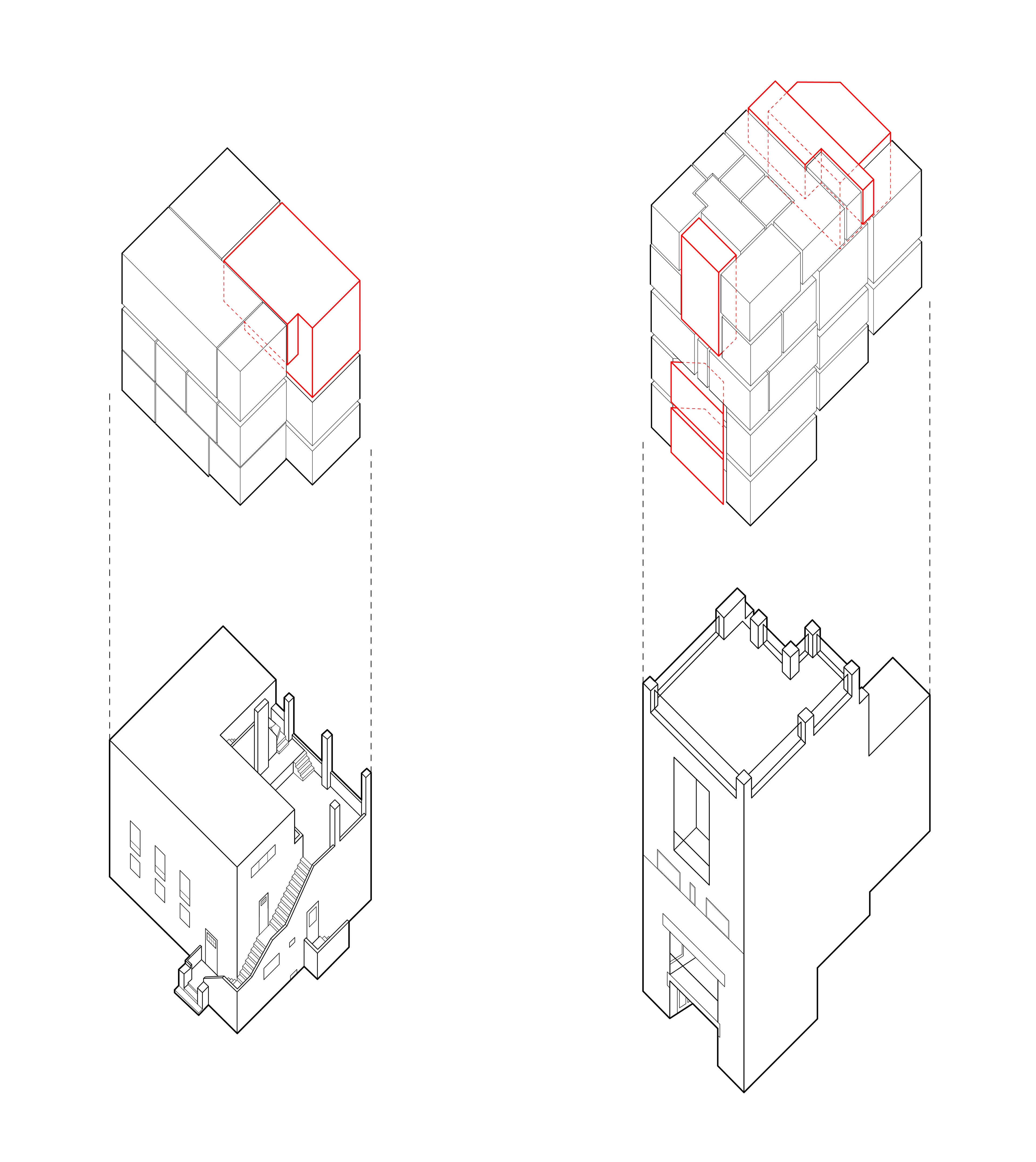
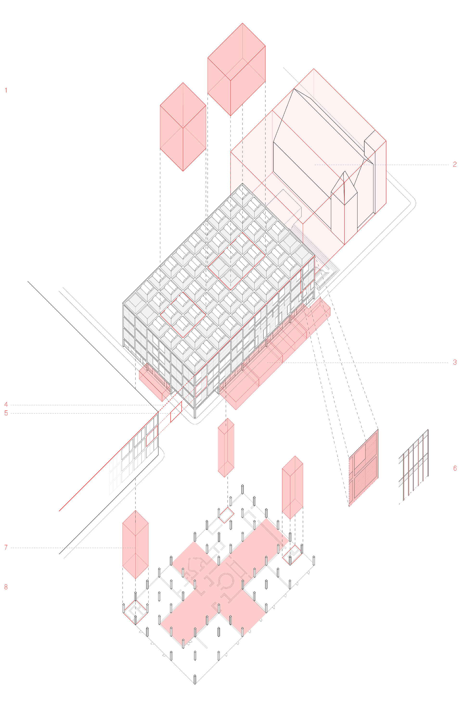
While Modernism was generally non-contextual, Guild House’s design responds to the characteristics of its surroundings in many ways. What caught my eye first was Venturi’s treatment of the windows on the front facade, which have a dynamic relationship with the road, getting larger the further they are from it, offering comparable views of the street for all north-facing units. Venturi also steps the facade back in order to maximize the number of apartments facing south, southeast and southwest, recognizing the spatial demands of the street. This also results in an asymmetrical building whose front is different from its back, another anti-Modernist allusion. Guild House is also analogous both in structure and materials to the surrounding buildings, being of a traditional masonry construction, using common brick, which Venturi even notes in “Complexity and Contradiction” is darker than usual to match the smog- smudged brick of the neighborhood. Another material to note is the double-hung window, which recalls traditional Philadelphia rowhouses, such as those directly behind Guild House. Venturi also uses precedence to move away from the lack thereof in Modernism. The first floor and a half of Guild House is painted white, and he introduces a white stripe part way through the fifth floor to evoke the proportions of a Renaissance Palazzo. Other similarities include a cliff-like facade without any large protrusions and facade symmetry with emphasis on a centrally-placed portal, which Venturi does through his use of an oversized black granite column and fine marble detailing at the entrance. Similarly, Venturi notes his stacking of the base, balconies and arch unifies the facade like a “giant order.” Venturi also reintroduces ornament as a symbolic element in multiple instances. He places a giant, gold-anodized TV antenna-like sculpture dead center on the roof, making reference to the work of famous sculptor Richard Lippold in its design several times in both “Complexity” and “Learning from Las Vegas.” The white base and stripe, which divide the facade into three uneven stories contradict the six real and equal floors of the building. This is in direct opposition to Louis Sullivan’s famous functionalist principle of “form follows function.” Finally, other postmodern elements are the Diocletian window which is not structural like a real Diocletian window, but instead hides the true structure (arranged like a true Diocletian) behind the glass, as well as the column at the centre which is completely off-center and oversized in true Postmodern fashion.
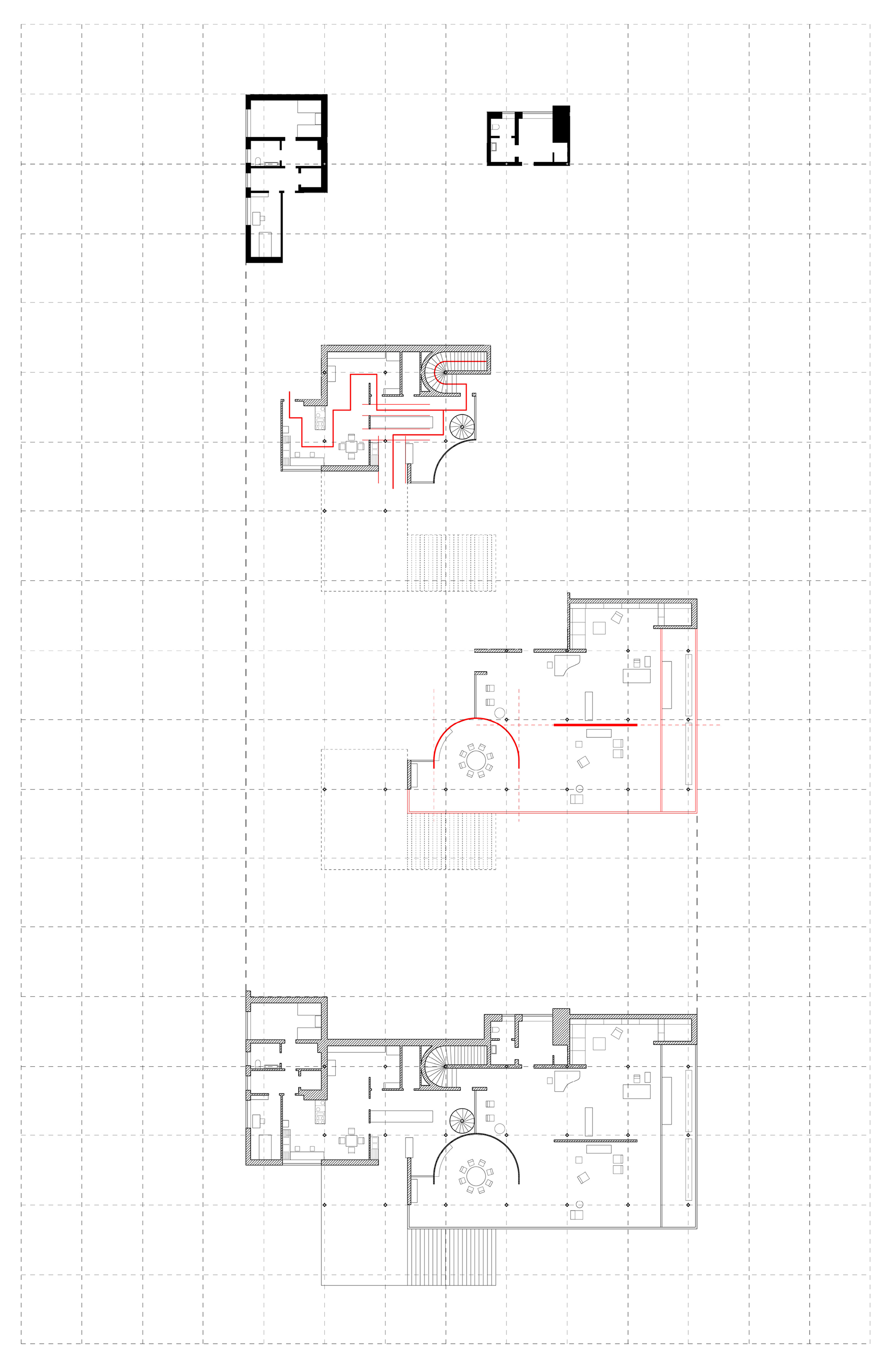
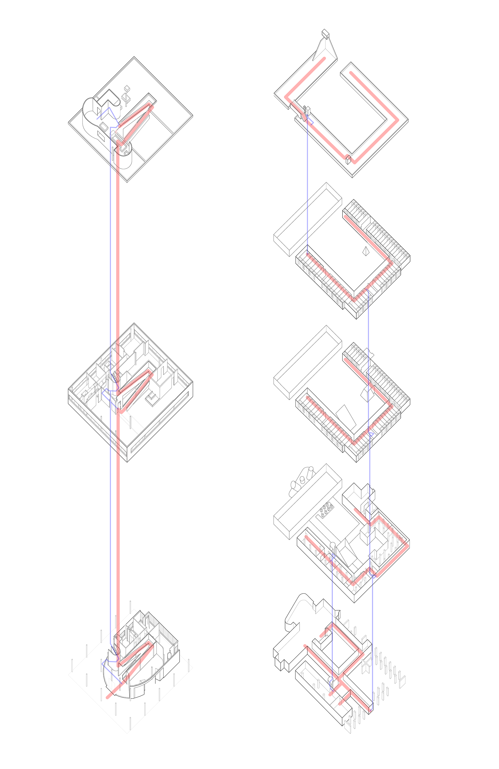
The Yale Center for British Art was the last project Kahn worked on before his death, in contrast to one of his first major commissions, the Yale Art Gallery, right across the street. It was completed in 1974, not long after his death and opened to the public in 1977. Before this analysis, I thought this building was quite modern, but was surprised to find there is actually quite a lot that subverts modern theory. Beginning at the top, I have pulled out the two interior courtyards of the museum. This is atypical for a modern museum and is something that does two things, it situates the building as unmistakably part of Yale campus, echoing James Gamble Rogers’ Yale courtyards as major interior rooms, and second, clearly indicates an influence of neoclassicism, as neo-classical museums are traditionally built around two courtyards, think Schinkel’s Altes Museum as an example. Moving onto context, in order to respect the Cavalry Baptist Church, now the Yale Repertory Theater, Kahn set the British Center back from the Theater by essentially the width of the Theater. The Center for British Art was also the first museum in the United States to include commercial entities (retail shops) in its building as a compromise to the city. I believe this makes the building inherently contextual as the whole ground floor was designed to incorporate local business. The building also maintains the street wall, the typical building height of downtown New Haven, and the bay proportion of the surrounding buildings. In “The International Style” by Hitchcock and Johnson, they define volume rather than mass as one of the principles of the new architecture. In the Yale Center Kahn uses modern technique and modern image to produce a static mass, not volume -- a subtle subversion of modern theory. While Mies, for example, would use I-beams and inset glass panes to maintain a trabeated aspect, never allowing the building to become dense or massive, Kahn inverts the formula here, using the same thin elements as Mies, but compressing the volume against the outside surface, producing not a light, piloti, building, but one that is undoubtedly dense and full of mass on the exterior. It may also be interesting to note that in contrast to a Mies building, which is generalized and universal, with the same form and language for an office building in New York as an apartment complex in Chicago, Kahn always considered the program, and I would argue the Center connotes “museum,” not simply “building” as in Mies.
YALE CENTER FOR BRITISH ART
(1974)
(1974)
LOUIS KAHN
KITAKYUSHU CENTRAL LIBRARY
(1975)
(1975)
ARATA ISOZAKI
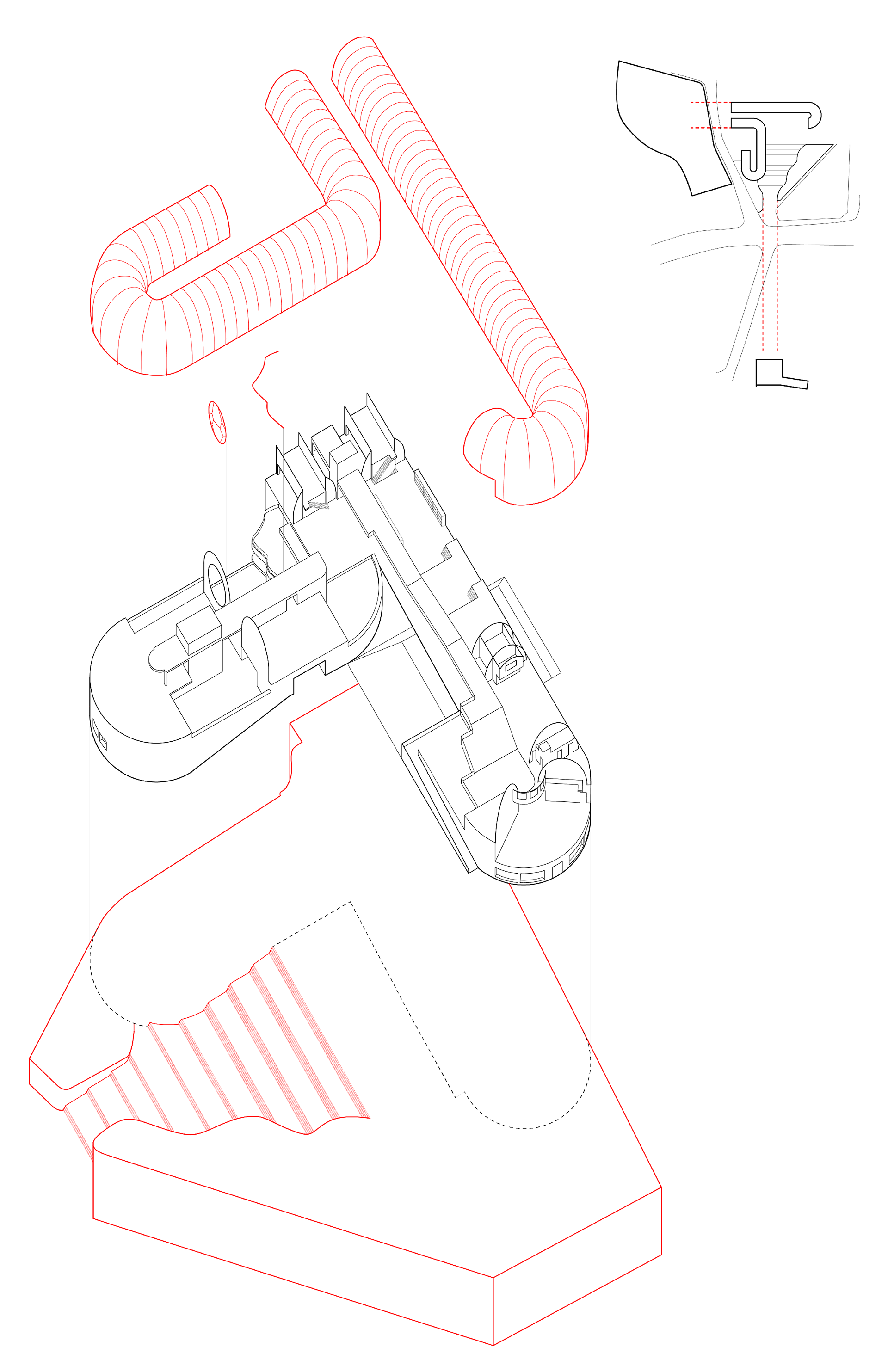
The Kitakyushu Library is a complex consisting of a historical museum and a municipal library in Japan, built in 1975. Beginning in the top-right, we see context plays a role in the building’s design and orientation, as Isozaki chose to begin his parallel semicircular roof vaults specifically to offer views of a nearby park to the east, and to orient and include a monumental lead up of stairs to the entrance facing an unobstructed view of a historic castle. Moving to the larger diagram, we see his use of a neoclassical-style barrel-vaulted ceiling throughout, which he said himself was inspired by Etienne-Louis Boullee’s design for the French National Library, which is also, a library. There is also a large circular stained-glass window at the end wall of the historical museum section. The pattern was based on diagrams found in “Gengo,” an 18th-century book with a connection to the area the library is situated in. The building is also partially built on a podium making quite a monumental entrance, and is accessible either from the upper level or from the inside of the podium at street level. Finally, the rest of the building in its use of pure geometric forms like the semi-circle, seems to be moving away from these forms to create more experimental forms less formally con- structed in certain areas.
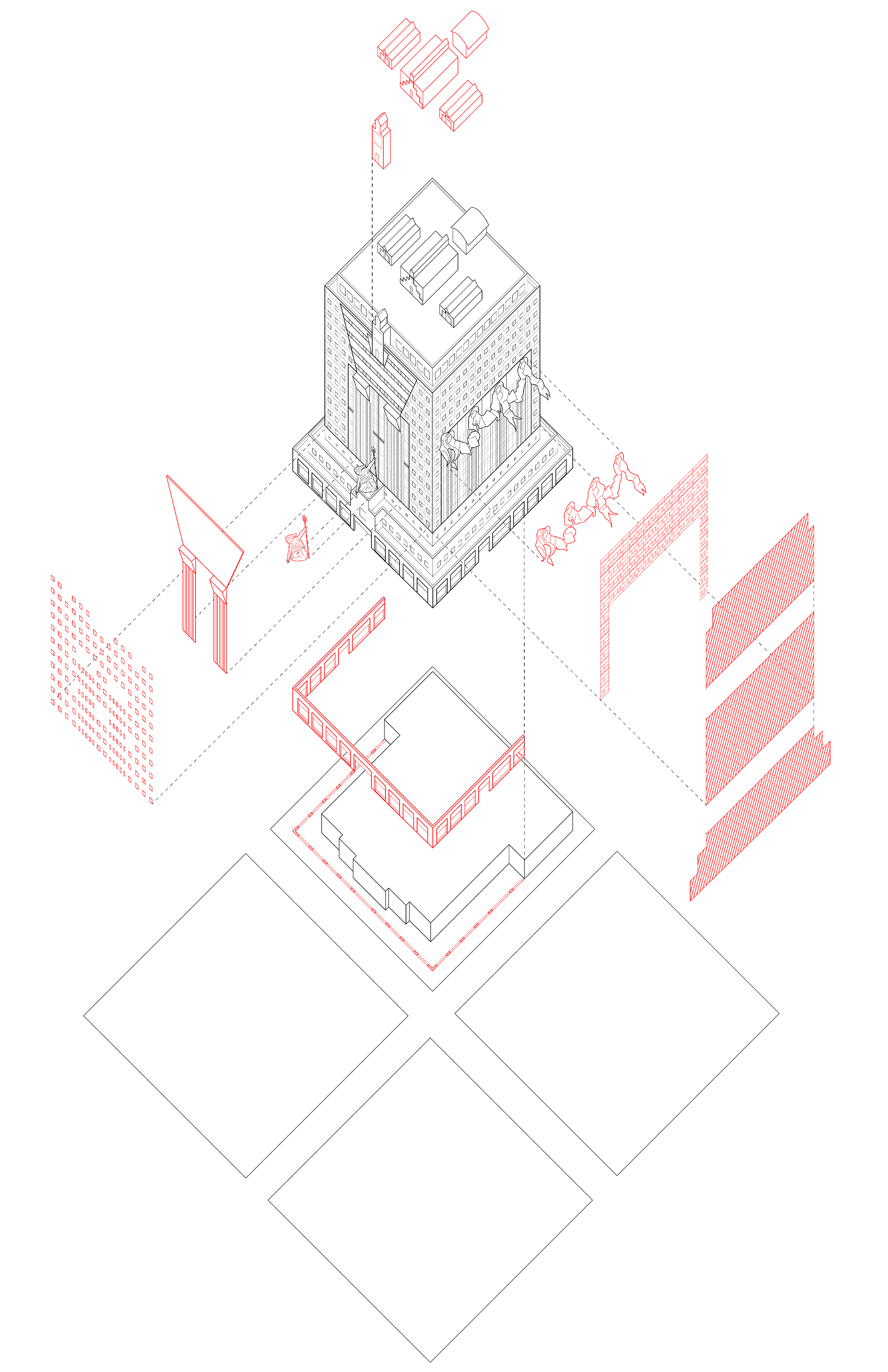
The Portland Building was the result of a competition won by Graves to design a large civic structure for everyday workers, right beside city hall. First and foremost, its program in itself is Postmodern, as even before Graves’ interventions, it was intended to be a populist design. The program specifically called for “something unlike the dehumanizing Modernism.” It is widely considered to be the first Postmodern tall office building. Starting at the bottom, I have overlaid the block structure of Portland, which is arranged in a perfect square grid. Graves himself stated on many occasions he wanted this grid to be reflected in his design, which you can see is evident in all of the square elements throughout. Moving up, the program called for “walls which define the street and stores which spill out into the sidewalk” so Graves steps out the lower floors of the building and creates a loggia on three sides, borrowed from the Renaissance and Middle Ages, essentially a covered exterior corridor open to the elements. Moving up further and to the right, I have pulled out the garlands which are one example of ostentatious ornament unseen in buildings like this since Art Deco, very anti-Modern, and to its right, the facade pattern, which was originally intended to be in terracotta to echo historic buildings of Portland, but he settled for concrete due to budget concerns, nonetheless, forming it to a masonry-like pattern to have similar effects. Next, furthest to the right, I have simply pulled out the tripartite division of foot, body and head that is so clear in each of the four facades, a form of anthropomorphic metaphor Graves wanted for his building housing the representatives of the people. To the left, more ornament, a giant statue of Lady Commerce, Portlandia, right in the middle, greeting you as you enter, dividing the shops at ground with the city offices in the center. To its left, overscaled columns holding up an oversized keystone, again symbolism representing the city offices in the body holding up the rental offices in the head. Finally, on the left end, the windows are symbolic, meant to evoke “one window, one worker.” In contrast to the Modern window-wall or fenetre-en-longeur, these windows were meant to frame one view, making certain the distinction between inside and outside. This intention was really clear by Graves’ choice to separate all of the windows like this, even in the oversized keystone, only the squares that are part of the grid are actual windows, despite being reflective glass on the exterior.
THE PORTLAND BUILDING
(1982)
(1982)
MICHAEL GRAVES
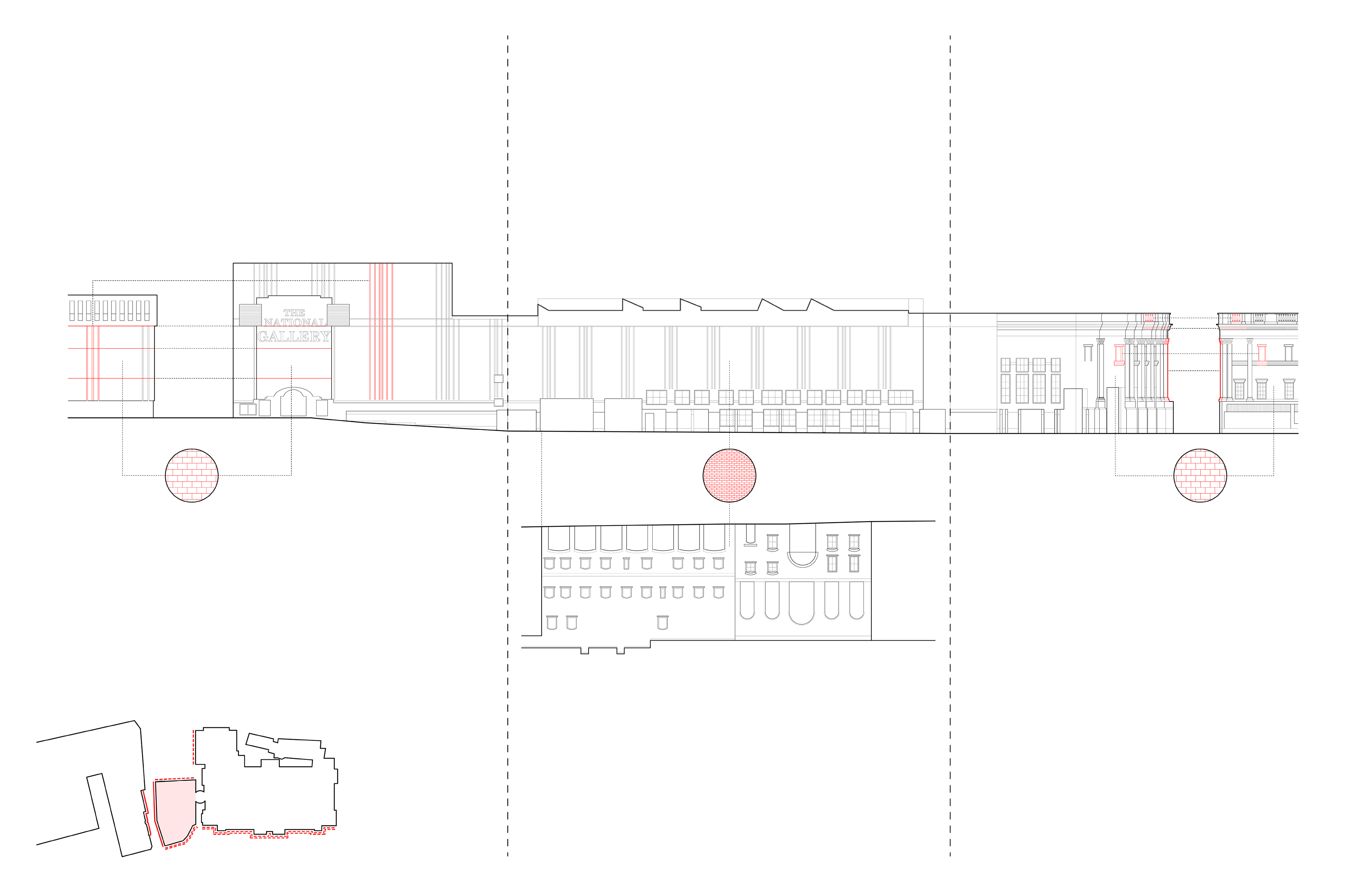
SAINSBURY WING
(1989 - 1991)
(1989 - 1991)
ROBERT VENTURI
DENISE SCOTT BROWN