Formal Analysis I
Elective Course, Yale University
New Haven, CT
Fall 2021
Instructor: Peter Eisenman
The following drawings were produced for Peter Eisenman's class, Formal Analysis, at the Yale School of Architecture. This series takes a critical look at canonical buildings from the Renaissance and Baroque periods.
You can find my complete Formal Analysis I portfolio, with written analysis, on Issuu, here.
DONATO BRAMANTE
(1444 -1514)
(1444 -1514)
LUCIANO LAURANA
(1420 -1479)
(1420 -1479)
SANTA MARIA DELLA PACE | ROME, ITALY - 1482
PALAZZO DUCALE URBINO | URBINO, ITALY - 1454
PALAZZO DUCALE URBINO | URBINO, ITALY - 1454
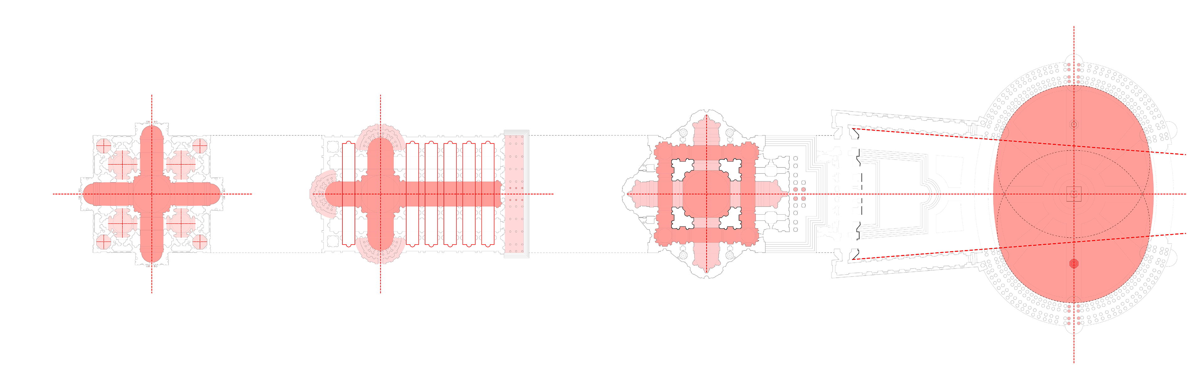
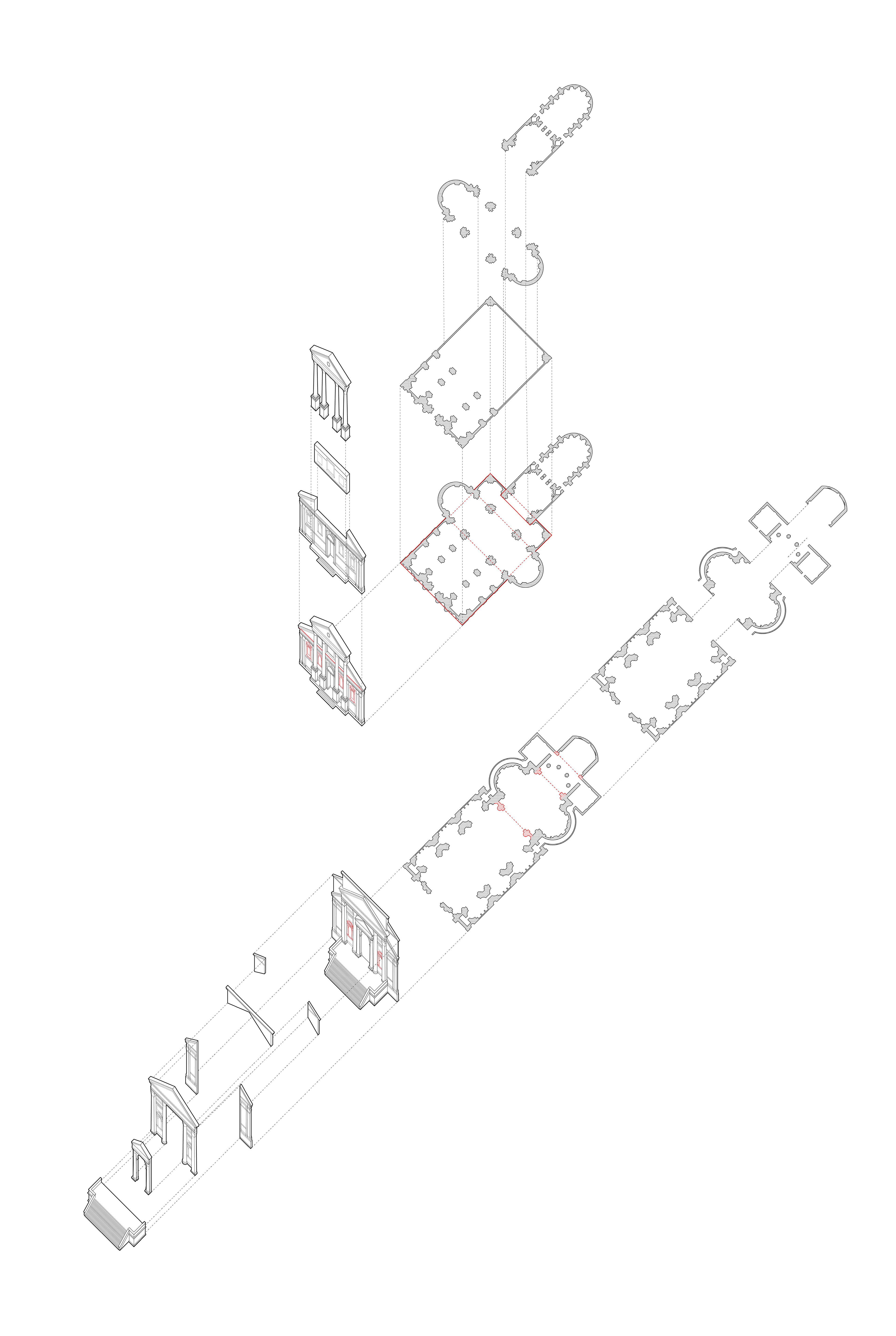
In Santa Maria della Pace, Bramante prioritizes the 45-degree angle view, in line with the ideals of Greek space. He aligns both arcades at the centerpoint of each end column, so that each column, including the corner column, sits on a perfect grid. This results in a corner column that is trapped within two piers, such that when you view the intersection of the two facades from a 45-degree angle, you see he has treated the corner in such a way that there is a part-to-whole relationship, in which the solid-to-void ratio of column-arch-to-open space is no different between the corner and the peripheral arcades. In these terms, both facades together appear almost continuous. However, when we view each facade on its own, axially, we see Bramante falters. We lose this part-to-whole relationship as the columns disappear off to the side. By contrast, in Palazzo Ducale Urbino, Laurana prioritizes frontality, in line with the ideals of Roman space. By tripling up on the columns in the corner and offsetting the grids by the width of a column, he creates a solid-to-void situation that is somewhat symmetrical and evenly spaced when viewed axially, but which suffers when viewed from a 45-degree angle, with a very thick corner that breaks up the two facades.
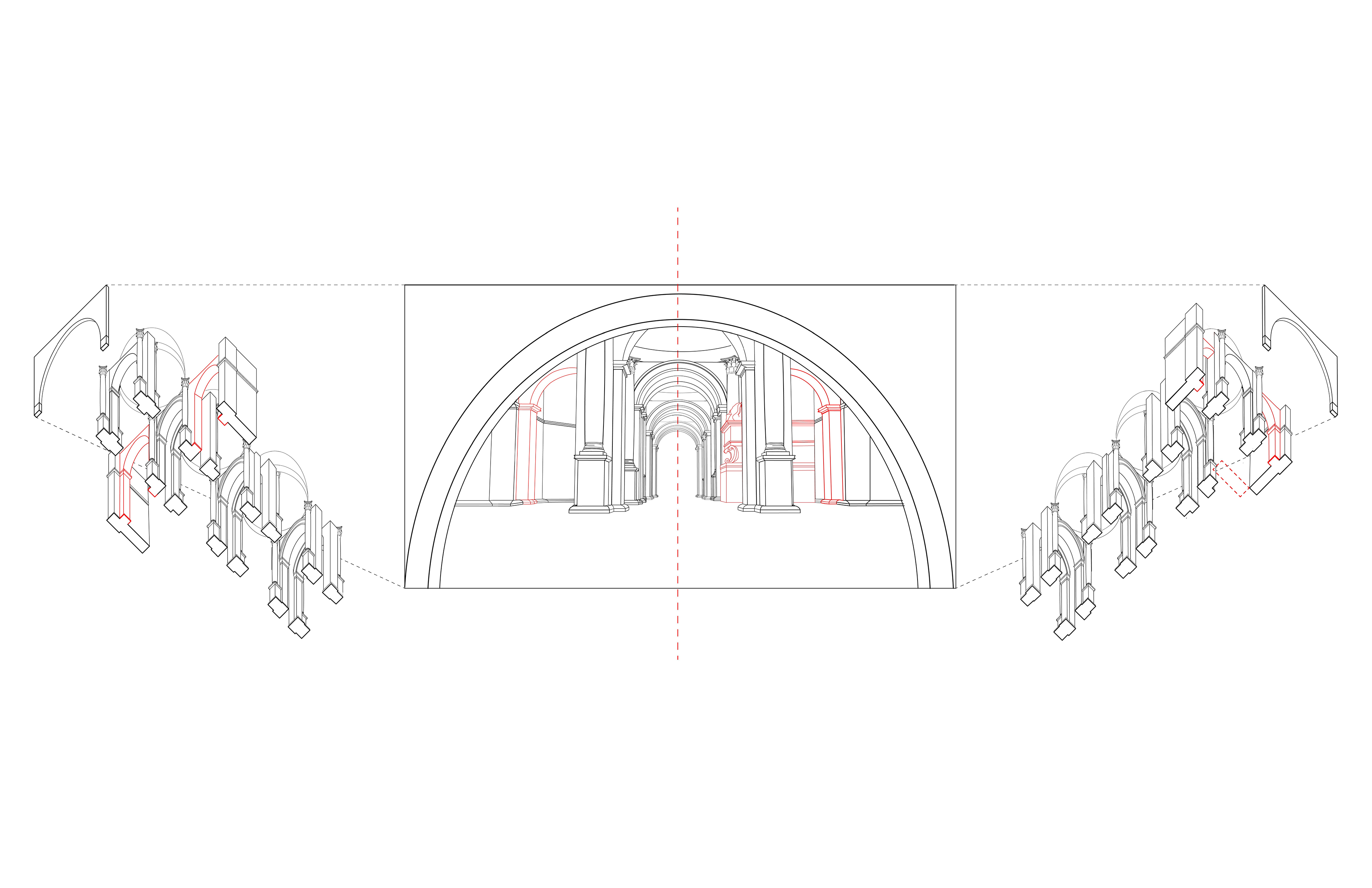
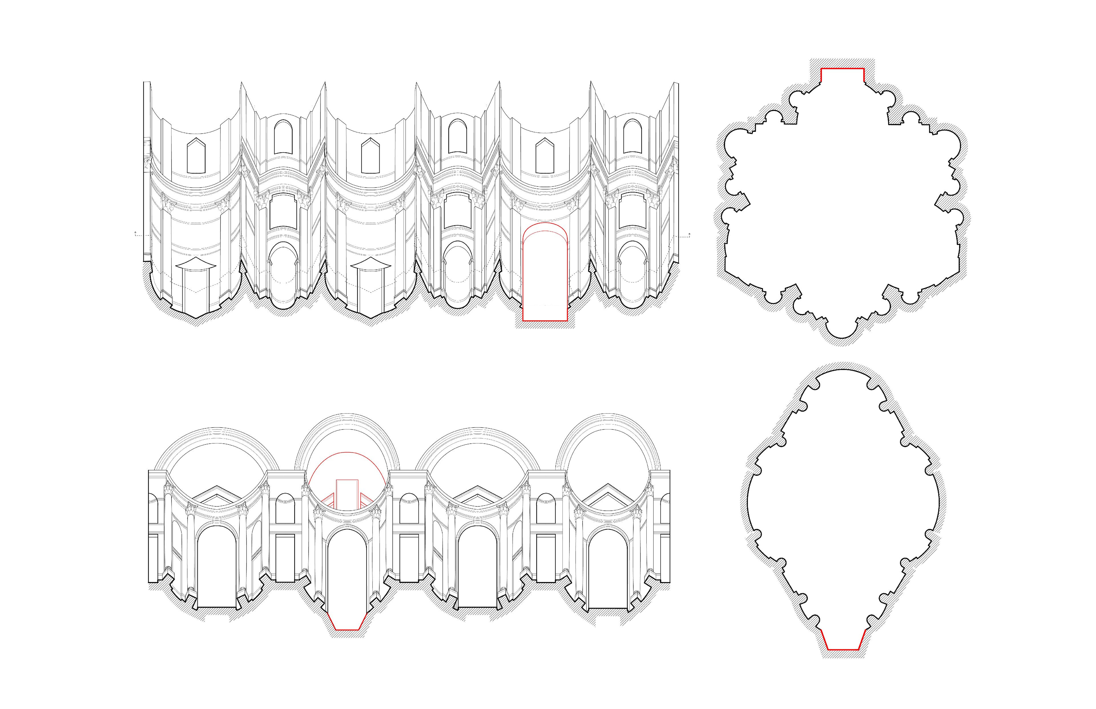
The image in the center is not traced from the painting. Rather, I digitally constructed all of the elements that would be in view and then simply viewed them in perspective from outside the half circles located on the far left and right of the drawing. During the process of this reconstruction, I was fairly certain about where most of the elements would be put. However, there was one element that was particularly confusing, and that was the arch (highlighted in red in the drawing) on either side. At first, I thought it must be a half-circle in line with the arch just behind the high priest, as it is the same diameter and height as the central arch, but then I noticed the altar-like block center-right, which appears to continue back into the side aisle. If that were the case, it is impossible that the arch could be both behind the altar in the nave, and also in front of it in the side aisle. In my drawing, I argue it can go either way. On the left, I place the full, half-circle arch in line with the arch behind the priest, behind the altar, and on the right, I place a quarter-circle arch (or buttress) in line with and slightly lower than the central arch nearest the viewer. Regardless of Raffaello’s true intentions, it is possible to rationalize both, and still have a plausible building.
RAFFAELLO SANZIO DA URBINO
(1483 -1520)
(1483 -1520)
EXPULSION OF HELIODORUS | APOSTOLIC PALACE, VATICAN CITY - 1513
MICHELANGELO BUONARROTI
(1475 -1564)
(1475 -1564)
BIBLIOTECA LAURENZIANA VESTIBULE | FLORENCE, ITALY - 1571
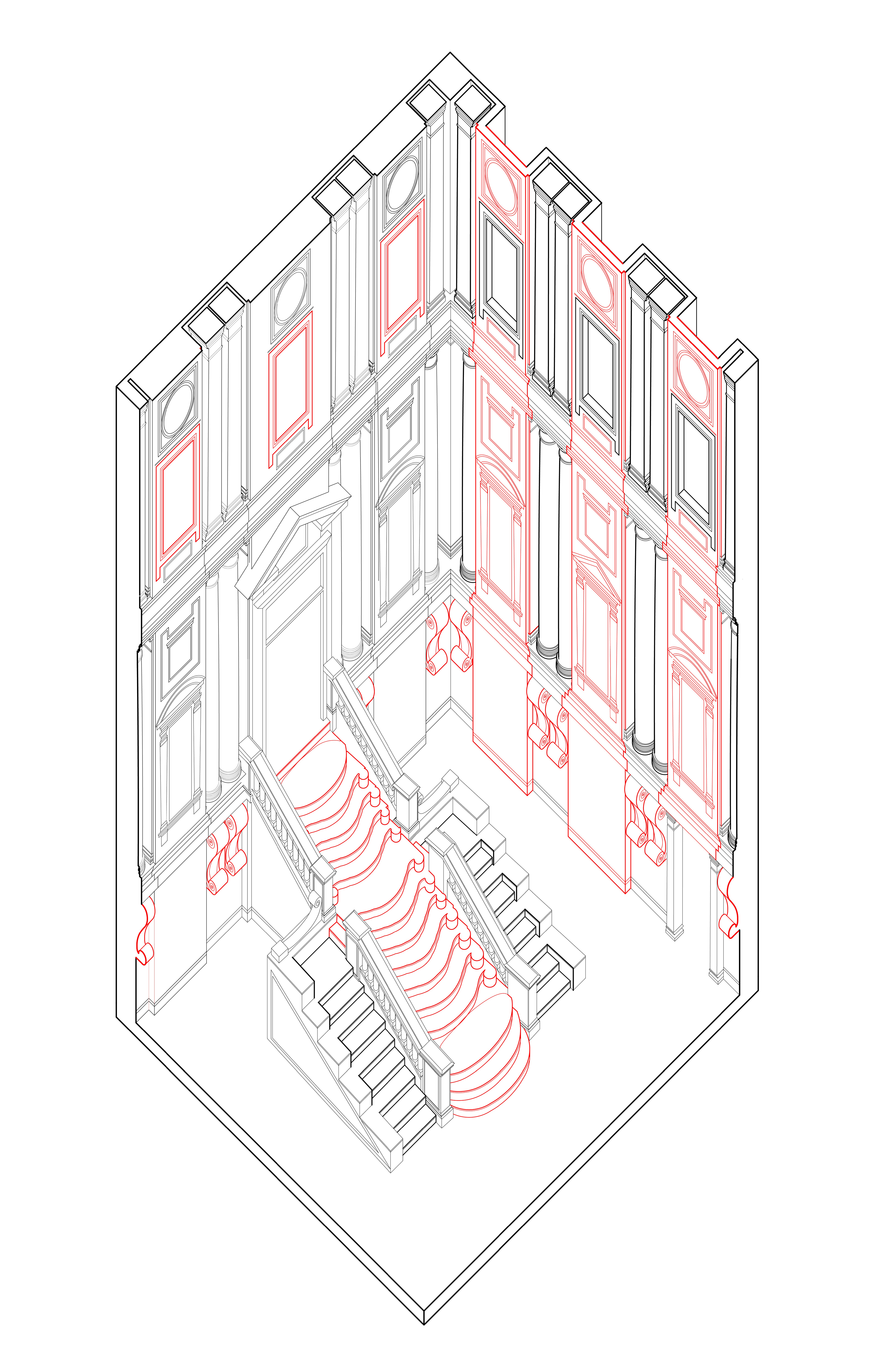
In the vestibule of the Laurentian Library, there is a correlation between the elements that are sculptural, or Mannerist, and between those typical of early Renaissance architecture, or the architectural elements used in the past. That is, that all the unique sculptural elements are impractical while the commonly-used elements are functional and/or structural, or in other words, rational. In red, I have highlighted the central flight of stairs, flanked by a standard flight of stairs on either side delineated in bold, black. The central stair is as sculptural as it is impractical, so much so that it appears to be off-limits in the majority of photos of the space on the internet, blocked off by two stantions with a velvet rope hanging between, forcing visitors to use the “normal” stairs instead. I also highlight the consoles beneath the columns in red, as contrary to their typical usage, they serve no purpose other than ornament, being that they latch onto the place below the columns rather than support them from below. I draw another dichotomy in the uppermost third of the room, between the ornamental window-shaped reliefs on the left and the actual, functional windows on the right. Finally, rather than highlight the columns for being behind the wall plane as Mannerist, I argue the walls protruding are the unprecedented, sculptural element, as they demand to be seen as structural, but in reality, serve only to enclose the space and pack themselves with ornament. In this case, the columns and pilasters are true to their functions and actually support the roof beams, hence their delineation in bold.
In Il Redentore, Palladio stacks (one on top of the other) the elements of the facade in addition to the plan, so that each part is either viewed or experienced on its own. In contrast, the elements of San Giorgio Maggiore’s facade and plan are intersected (through one another). I have highlighted in the unaltered plans and sections my evidence for such claims. In San Giorgio’s facade, which I argue is the result of intersections rather than stacking, the lower cornice of the pediment continues through the front portico in and is visible behind the colonnade, something that is not seen in Il Redentore. I have also highlighted the window-like motifs that are carried through the whole facade in San Giorgio, implying intersection yet again. This contrasts Il Redentore, which only has windows on the central portico and not on the periphery. This is evident in the plans as well. In the plan of Il Redentore, the supports beneath the central dome at the crossing break off from the rest of the grid, indicating appended spaces, rather than intersected spaces, whereas in San Giorgio, Palladio continues the rectangular nave past the crossing, and likewise, the apse into the nave.
ANDREA PALLADIO
(1508 -1580)
(1508 -1580)
IL REDENTORE | VENICE, ITALY - 1592
SAN GIORGIO MAGGIORE | VENICE, ITALY - 1610
SAN GIORGIO MAGGIORE | VENICE, ITALY - 1610
FRANCESCO BORROMINI
(1599 -1667)
(1599 -1667)
SAN CARLO ALLE QUATTRO FONTANE | ROME, ITALY - 1638
SANT’IVO ALLA SAPIENZA | ROME, ITALY - 1642
SANT’IVO ALLA SAPIENZA | ROME, ITALY - 1642
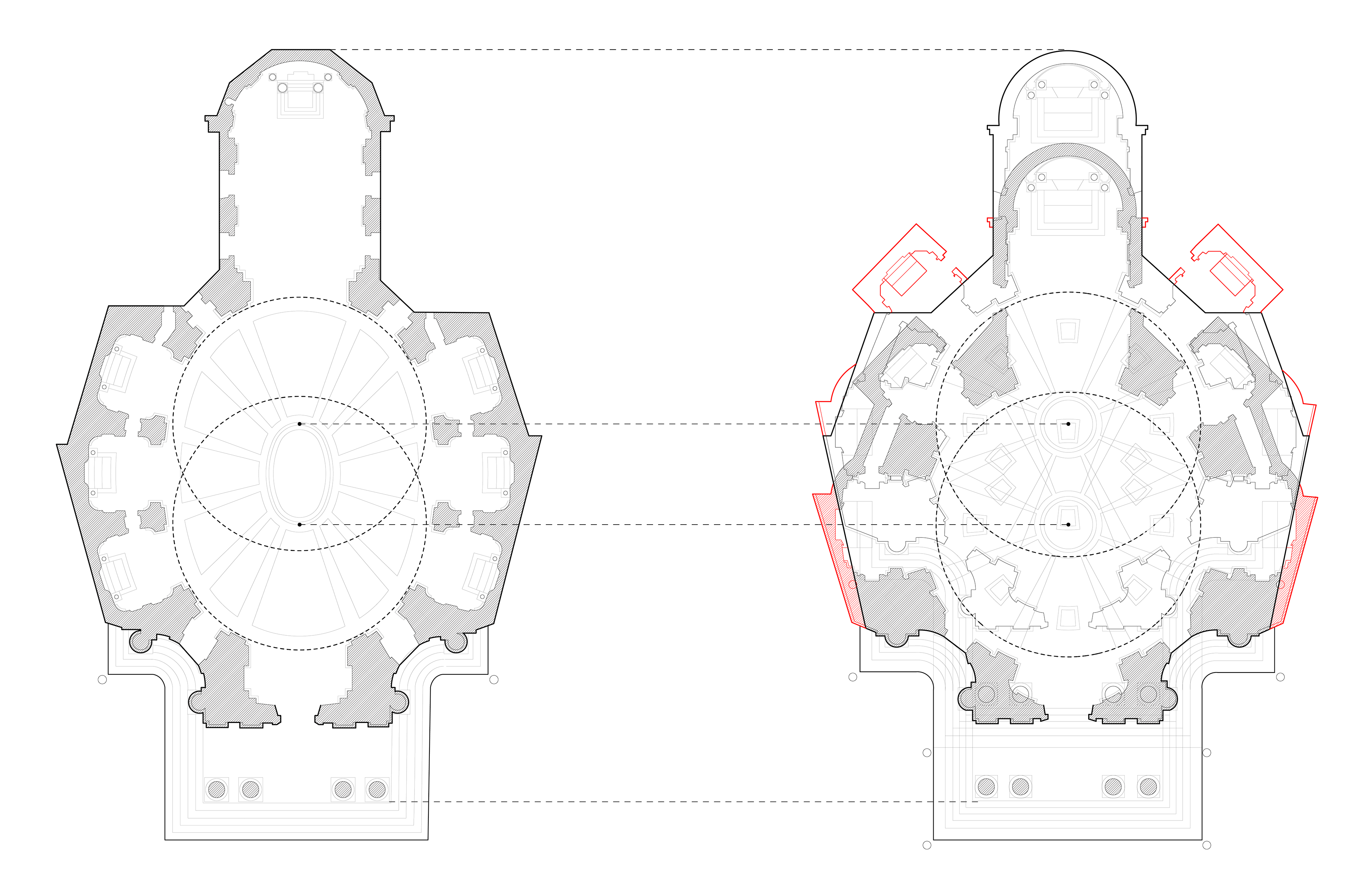
In both Sant’Ivo alla Sapienza and San Carlo alle Quattro Fontane, each second interior facade repeats and in both, the symmetry is broken in one key area. My argument is that in Sant’Ivo, it is the apse that breaks the symmetry, while in San Carlo, it is the entrance. In both churches, Borromini introduces a window at the entrance only. However, in Sant’Ivo, this window does not break the geometry of the space, it is simply inserted behind the geometric opening, whereas in San Carlo, the window cuts through the interior pediment which appears at each of the three other alcoves, differentiating it in form from the other alcoves. In Sant’Ivo, the entrance uses the same geometry as the second alcoves to both its left and right, however the apse uses a completely different geometry than the second alcoves to its left and right, which echo each other but not the apse.
The first thing I noticed when I saw these plans beside one another was that Miracoli was shorter, from entrance to apse, just as the circle has a smaller diameter than the long axis of an ellipse. In my analysis, I essentially duplicated Rainaldi’s plan and offset it, so that each of the centers of both the original and copy aligned with each of the two centers of Monte Santo, respectively. Through this analysis, I discovered there are many similarities in the silhouette generated by this superimposition and Bernini’s elliptical church silhouette, such that it is possible he performed this same operation of duplication and translation in determining the overall exterior form of his church. The thick black denotes similarity, while red indicates where Bernini deviates.
GIAN LORENZO BERNINI
(1598 -1680)
(1598 -1680)
CARLO RAINALDI
(1611 -1691)
(1611 -1691)
SANTA MARIA DI MONTE SANTO | ROME, ITALY - 1678
SANTA MARIA DE MIRACOLI | ROME, ITALY - 1679
SANTA MARIA DE MIRACOLI | ROME, ITALY - 1679
GIAMBATTISTA NOLLI
(1701 -1756)
(1701 -1756)
GIOVANNI BATTISTA PIRANESI
(1720 -1778)
(1720 -1778)
NUOVA TOPOGRAFIA DI ROMA | 1748
IL CAMPO MARZIO DELL’ANTICA ROMA | 1765
IL CAMPO MARZIO DELL’ANTICA ROMA | 1765
While considering Nolli as primarily a surveyor and cartographer and Piranesi an archaeologist and antiquarian, I hypothesized that Piranesi’s map of invented “ancient monuments” would likely be derived from Nolli’s highly accurate map of Rome. My analysis consisted of a superimposition of the two maps at equal scales, in order to determine to what extent Piranesi referenced Nolli’s map. The highlighted regions denote overlaps, and from this analysis we can achieve several conclusions: Firstly, of the over one thousand buildings and public spaces depicted in Nolli’s map, Piranesi chooses to develop only four in their original locations, namely the Mausoleum of Augustus (top right), Castello Sangallo (top left), the Pantheon (middle right) and Piazza Navona (middle left). I suppose he believed these spaces constituted monuments on their own. Second, Piranesi was heavily inspired by Nolli’s topographical shading, himself shading along a very similar path, even turning the white space in the upper right shaded region of farmland in Nolli’s map into a massive structure of sorts.
ST. PETER'S BASILICA
(1506 -1667)
(1506 -1667)